
There are so many good ideas for laying out space. Some of my favorite friends are fashionistas who understand how the human body is really a blank wall, ready for decor, colors, drape and coordination. A wall is also like a blank canvas and hanging art well is an art form itself. But good news, it is easy to elevate your walls!
Before are four good tips that will keep you from amateur placement or simply copying everything you see on Instagram. Choose your art to reflect you and your family’s values (read my post on how to find that kind of art “How to Choose Art“) then display it like a pro. It’s pretty easy once you know how.
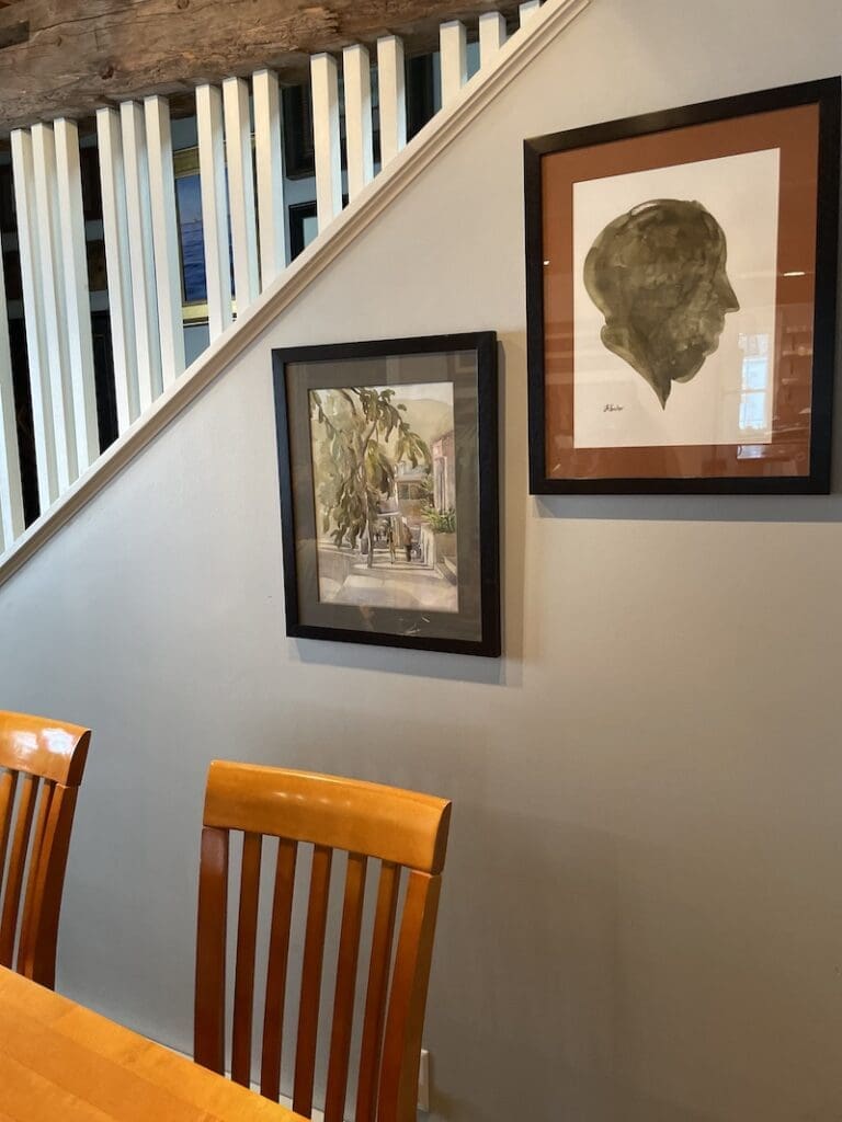
Tip #1 – Grouping
Group your art in odd numbers, like 1 or 3 or 5 frames to a space. Groups of two work if the frames are the same size. Group your art by subject matter, a whole group of portraits, for example can surround one larger landscape. You can even choose a theme, like memorabilia, and frame your children’s letters to you, along with vintage photos of family (don’t we all have some of those?), some silhouettes or old postcards of your hometown.
Tip #2 – Spacing
If you’re naturally artistic, you can just hold the painting up on the wall and say, “That looks pretty good” and wing it. But most people need a little guidance. One of my favorite art biz blogs Red Dot Blog recommends hanging art at six feet high. That’s a good rule of thumb, especially for a gallery. So start with the frame’s top edge at six feet, and go from there. But since the people in our home deserve a good view of the art we all choose, I also recommend you pay attention to who is going to use the room and hang art based for them. I hang the art a little lower, this includes the mirror, for my boys in their bathroom. I want them to feel like the room was designed for them, not for taller adults. For my son on the top bunk of his bed, I’ve hung art higher up so he can see it when he’s lounging.
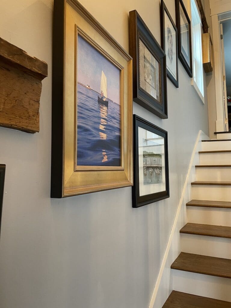
Tip #3 – Puzzle Pieces
This works well for mismatched frames. Stagger or puzzle the frames to fit together so that they overlap in different, interesting ways. I find that as long as you can match the distance between edges of then frames (say all 2 inches apart), you can get away with almost any combination. I have a wall where I’ve grouped one gold frame with all black frames. I have another wall where the frames are all mix-matched but are similar in style of art (like all fine art watercolors). You can group by color or subject matter or season. Finding one common theme helps. For instance, I have a wall of silhouette portraits that takes you down one wall.
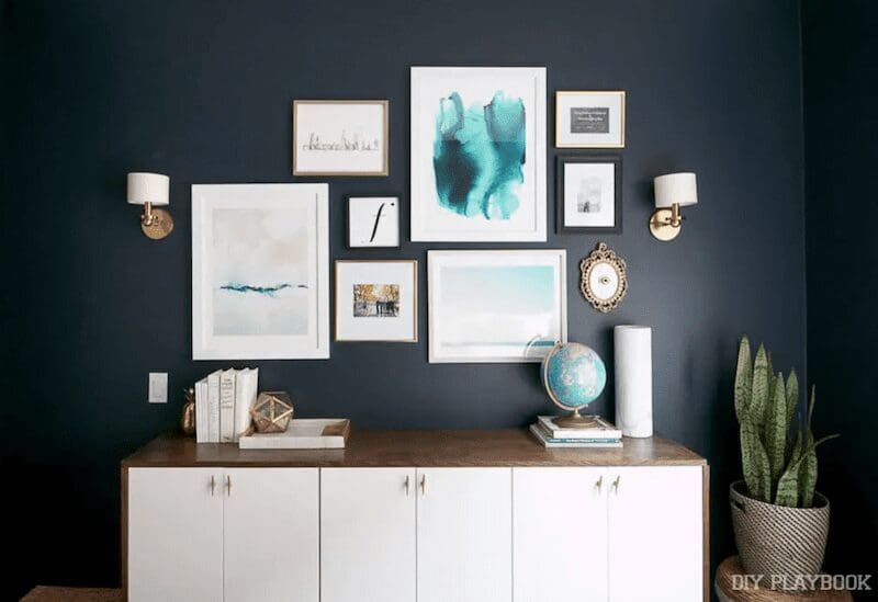
Tip #4 – Scaling
This is a big one, the rookie mistake of choosing art that’s too small for a space. You want to choose art that fills a space. If you hang, say my mini landscape above a couch it will look silly and rinky-dink. But if you choose a large painting or two same-size paintings that fill up the wall space above a couch, you’ve nailed it! There’s more about this important idea at The DIY Playbook here. But let me say, it’s better to go bigger and powerful than too small. One quick way to double check is offered in the final pro tip below.
Final Pro tip
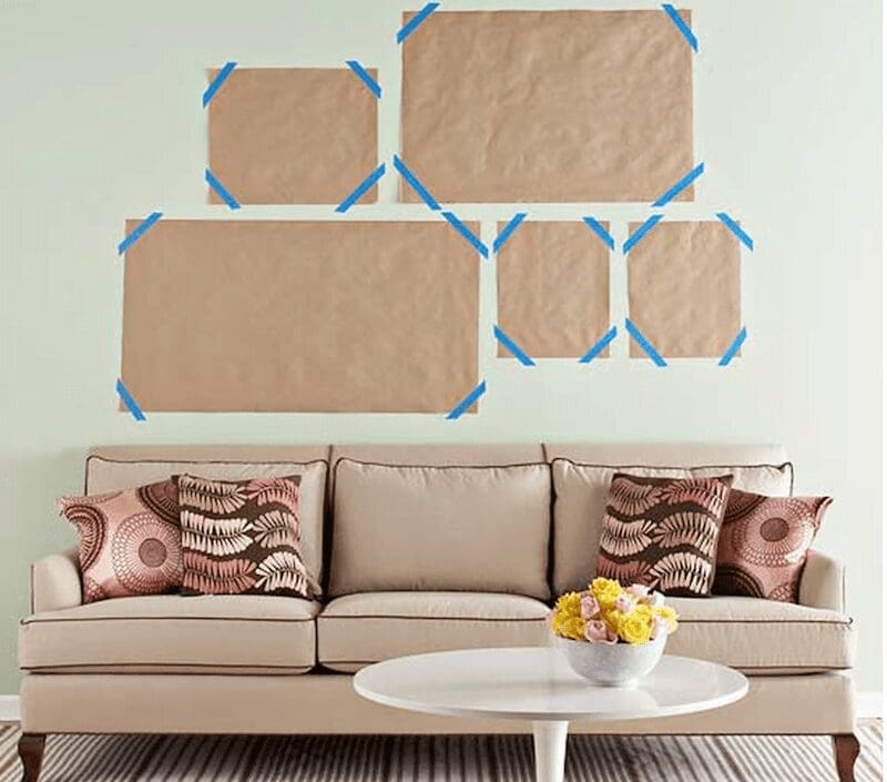
For those of you who don’t like to make multiple holes in the wall, I recommend you choose the art you want to group together, then cut out a pattern in each of the sizes of the frame. You can use wrapping (the white side) or butcher paper, then use blue painter’s tape (or clear or brown tape if you remember to take it down the same day) to tape these sizes on a wall. These become your template so you can move them around until you find a nice arrangement. Don’t hesitate to leave these papers up for a day or so and walk past them. You’ll start to notice if the arrangement feels odd or looks lopsided. Another quick way to see if it’s too big or too small of a space is to snap a picture. I even do this for my art, I can see errors in a picture sometimes sooner than in the original painting. So take a pic and examine it.
Family News
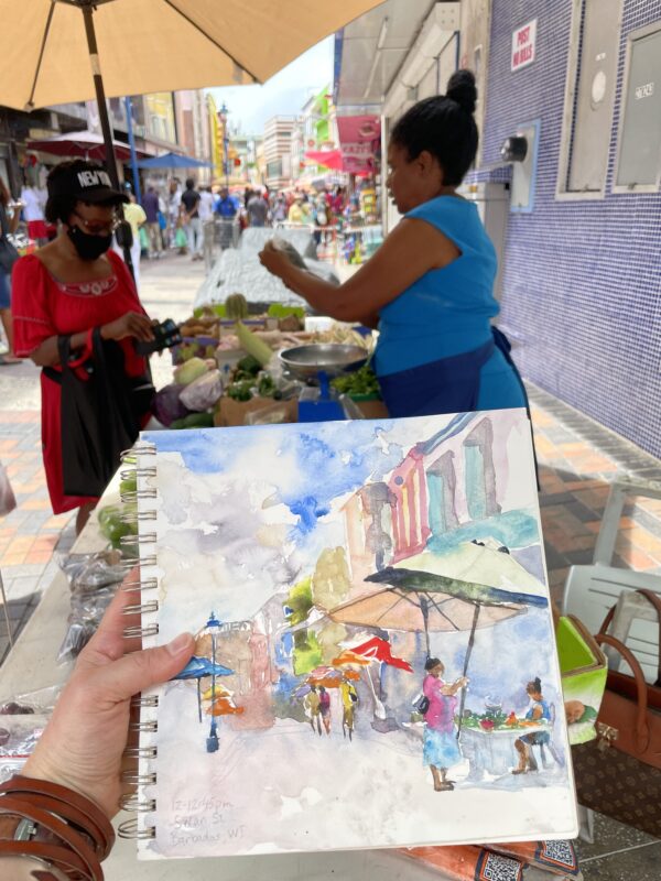
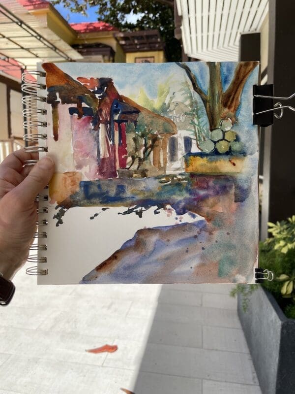
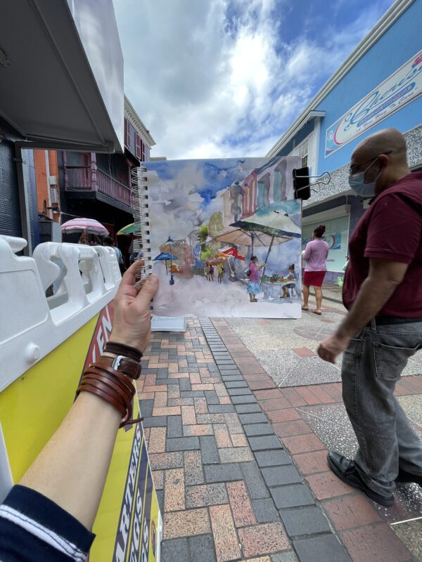
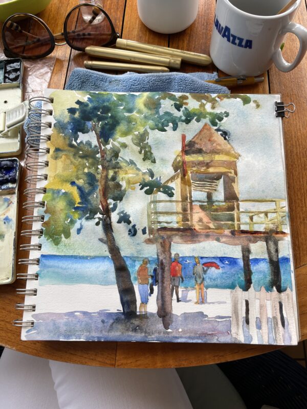
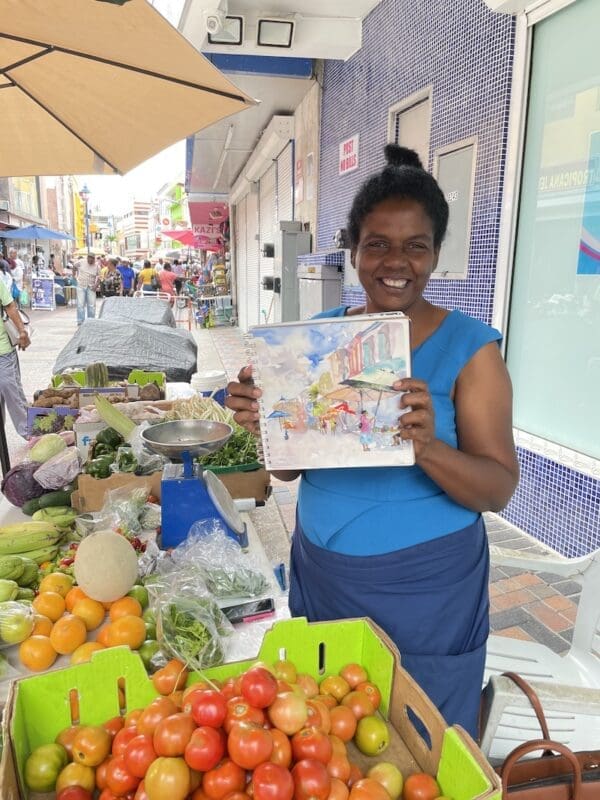
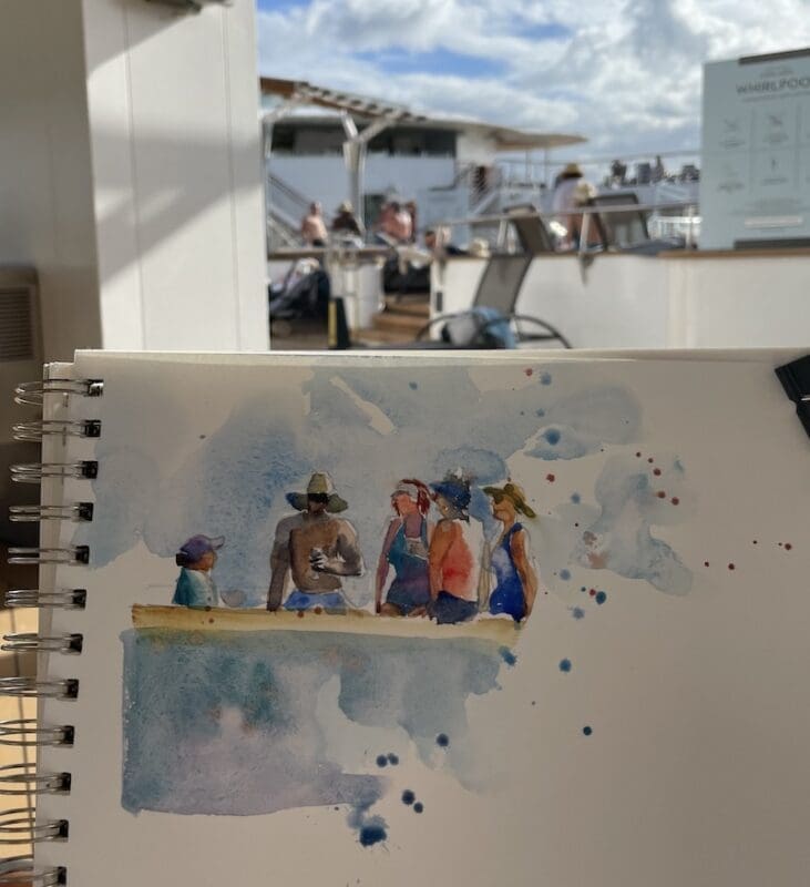
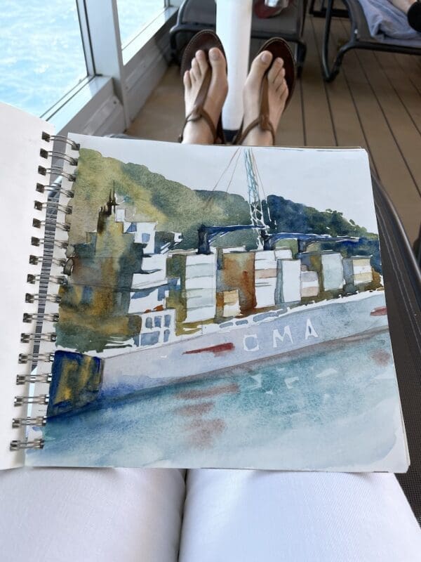
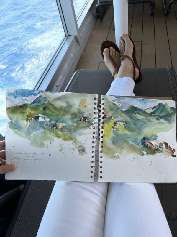
If you’ve been following me on my business page on Facebook or Instagram, you’ve seen some pics. We just got back from a wonderful cruise with my sister-in-law to explore the Spice Islands of the Caribbean. I got so many great ideas for new paintings. And I’ve been using fresh nutmeg (Grenada’s #1 crop) this week on pretty much everything. What a wonderful sunny holiday to take together as as family!
Below you’ll find some of the images from my travel sketchbook. Enjoy the tour! And don’t forget to have a little fun and browse my Shop. I’ve been adding so many new paintings!


2 Responses
A fun blog!!! Checking out all my groupings to see if they pass muster…haha
I’m glad you found me! Oh that’s funny, yep, I was doing the same as I wrote it. 🙂 Thanks for stopping by and for taking the time to comment.